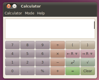
Recently I saw a couple articles on the improved calculator that will be shipping in Ubuntu 10.10 and I thought “Really? An improved calculator?” It turns out that the major, obvious improvement is a UI change. It seems odd. I mean, calculators are calculators right?
Take a look.
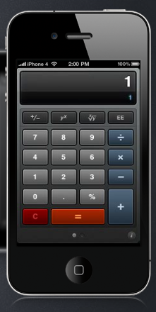
The second I saw it I loved it- the colors make the eye easily track where the button groups are. Reminds me of other calculator apps I’ve seen mentions of lately:
A little UI polish goes a long way to making an app fabulous to use.
A few years ago, an interesting blog article surfaced about the development of Coda, a web development app for Mac OS X. The toolbar was strikingly different- it really just meshed well with the overall UI. Coda is sofware that is just fun to use. Extremely slick and powerful. Anyway, the toolbar wasn’t possible to do using standard Mac OS X apis, due to a 3 pixel border they couldn’t get around and still use standard UI controls.
I’m just as much (maybe more) of a standardista as the next guy. But your app needs to be perfect and to do that, it may have to break rules. After a long development cycle, the team behind Coda threw out the system toolbar and wrote their own, even though it took a lot longer.
And all because we didn’t want to settle.
So take a look at your app. Are you settling?
In the end, by the way, the UI looked so good that Apple incorporated that look into the system toolbar in the next release of Mac OS X. It’ not rule breaking- it’s pioneering.

