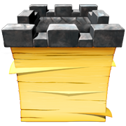
I know I go on endlessly about naming your app well. It seems like such a simple thing. Here’s an app I came across earlier. It’s for Mac, but I think the icon and name combination are excellent. The app is Nottingham.
 If you’re not aware, Nottingham is the town/area in which Robin Hood lived and ‘worked’ in English history. The name Nottingham has a form of Note in it- Nottingham (I don’t know if the developer wants it to be pronounced Note-ingham). I’m pretty sure Nottingham, the location, has nothing to do with taking notes- that’s OK! And the icon features a stack of sticky notes topped with a tower crenellation that takes it’s cue from medieval England’s architecture. It’s a very nice, distinctive icon. Very cool brand integration. Well done!
When it comes to your app’s name, be original. Don’t slap a G on it just because it’s in Gnome or a K just because it’s for KDE! Use some imagination. Jason Fried from 37Signals often talks about working with constraints. Instead of spending lots of time trying to overcome constraints, embrace them! Figure out your constraints and quickly move to work within them.
For an app name, here are some constraints:
- The name should have at least a tangential relationship with what your app does.
- If you’re going to intentionally mis-spell a word for your app name, you should have a reason for doing so.
- A large part of your users should recognize what the word(s) you’re using as a name mean- if you pick an ancient Inca name, you may not have too many users who understand what it’s for.
- The name should differentiate your app. No one but an OEM would ship an app named ‘Clock’. If you’re making a clock app there had better be something that sets it apart- use that feature in the name!
And for your icon, here are a few:
- Design your icon with both what the app name is and what the app does in mind.
- Don’t just use the first letter of the app name as an icon- that would qualify as an icon but so would a math equation.
- The icon will have to fit in certain sizes on the desktop- have a super-detailed version for the biggest and simpler designs as you get smaller.
- Use some different colors and contrast to make the icon interesting.